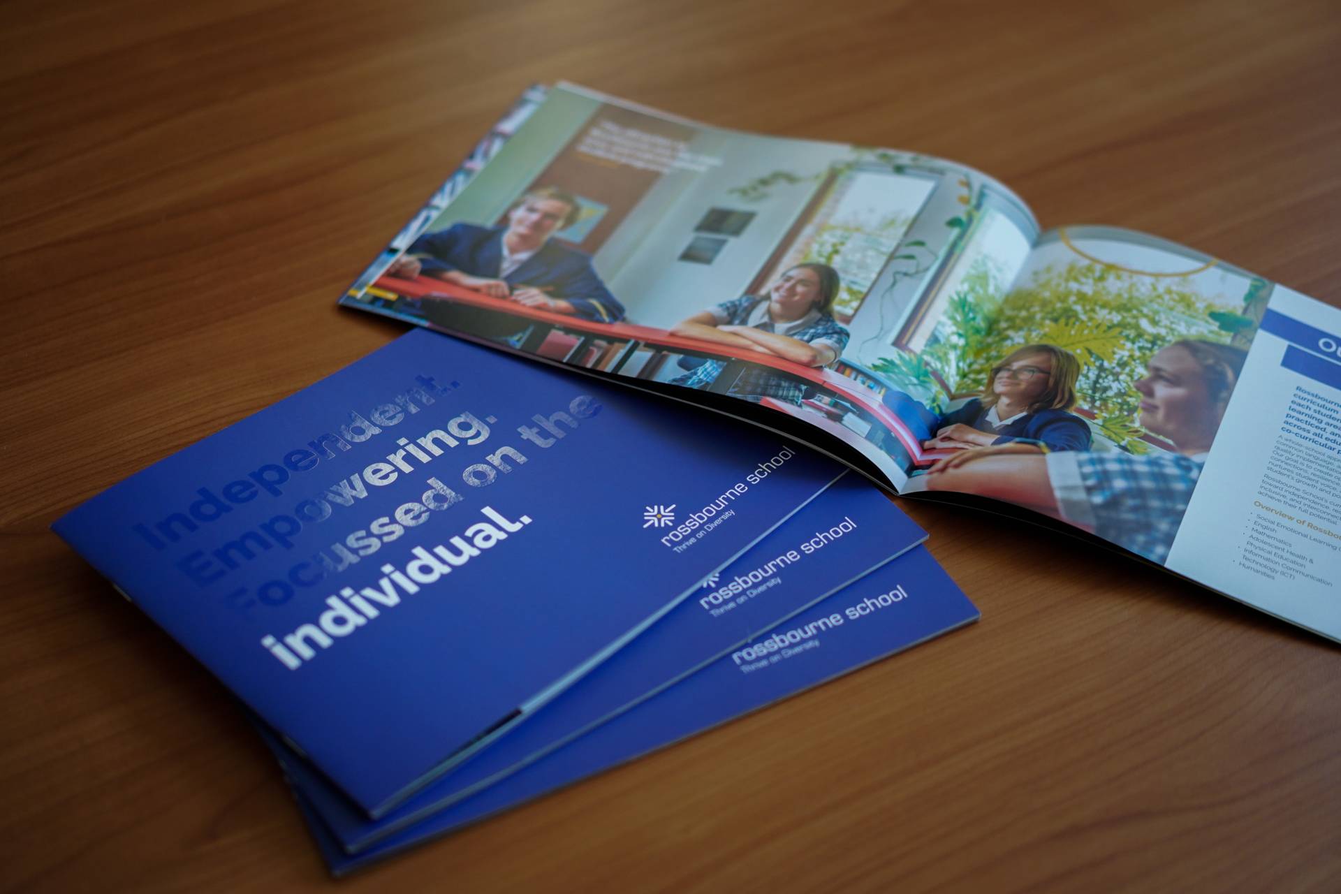
Bold Vision. Modern Voice. Rossbourne Redefined for Tomorrow.
Elevating Rossbourne's brand presence through minimalist, modern design and polished material, letting the design speaks on its own. The propectus' new look is clean and bold, utilising a mix of high impact imagery and strong typography.
This school prospectus design project reimagines Rossbourne’s brand presence through a refined minimalist approach that reflects confidence, clarity, and contemporary excellence. The concept centres on elevating Rossbourne’s identity with a clean, modern aesthetic and beautifully polished materials that allow the design to speak for itself.
A carefully curated layout system creates structure and consistency throughout, balancing generous white space with bold typographic treatments. Strong, modern typefaces establish authority and readability, while high-impact imagery captures the vibrancy of school life, celebrating community, achievement, and opportunity.
The restrained colour palette reinforces brand recognition, ensuring visual cohesion across every spread. Premium finishes and tactile paper stocks enhance the overall experience, positioning the prospectus as both informative and aspirational.
The result is a sophisticated, confident publication that communicates Rossbourne’s values with clarity and impact—an elegant expression of its vision, culture, and commitment to excellence, designed to resonate with prospective families and stakeholders alike